Fitbod
The innovative training algorithm and muscle iconography will guide you through the right sets, reps, and weight to reach your fitness goals.
UI Credit: Jesse Venticinque
Missing your name? Let us know.
Categorization
Available Equipment section: You can sort by suggested categories or filter the list view. Each listed equipment has a red check mark that indicates it's selected.
Fitness Goals section: The background image is used to support the overlaying copy.
Highlight: Visual aid of the muscle group highlighted💪🏾
Empty State
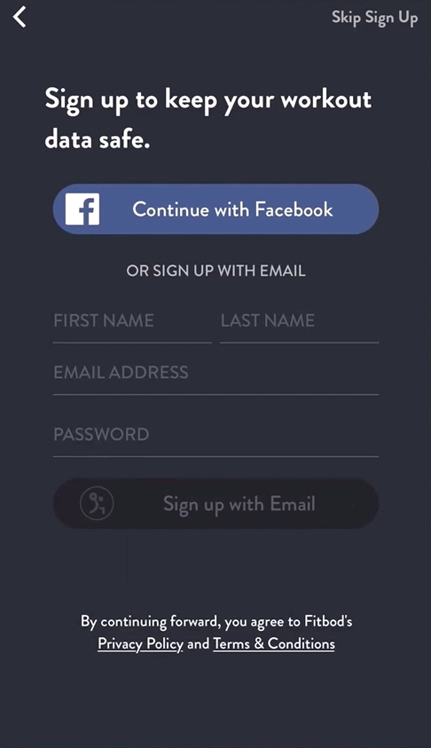
Every user starts with a free 3-day trial, so you have the option to explore the app before creating an account. However, there are call-to-actions (CTAs) in the header. Ex: 'Create a free account' 'Unlock.'
When you first start, your account doesn't have any data collected. There's encouraging empty state messages like 'You haven't logged any workouts yet!'.
Highlight: On the 'Saved Workouts' screen, the empty state says, 'You haven't saved any workouts. Tap on [button icon] to save a workout.' This message is direct and informative on what to do next. 👍🏾
Loading Indicators
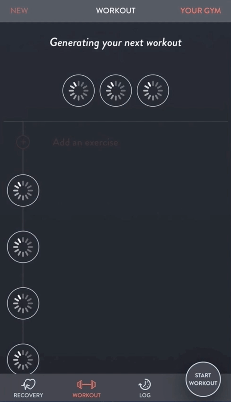
I'm not fond of the loading indicators used for workout icons. I'd prefer to see one icon in the middle of the screen, so the load is less jarring.
Highlight: The muscle iconography compliments the workout title. 🦵
Onboarding
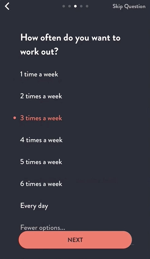
The short questions with iconography correlating with titles make it much easier for a novice to understand which muscle groups to choose.
Notification preview is a human-centered approach to engagement, but there's also the option to skip each question.
Highlight: The detailed illustrations take away the pressure of working out and encourages that it will be fun using the app. 🖼
Progression
Each time you use the app, it's training the algorithm to build and try your personalized workout. It understands your strength-training ability, studies your past workouts, and adapts to your available gym equipment.
Highlight: During a workout, you can select the muscle group you're training. The reps amount is selected when it transitions to the next screen. 🔢
Typography
Similar to Brandon Grotesque


