Target
The target app makes it easy to shop from anywhere, allowing users to search their entire selection, complete with online promotions and flexible ordering options.
UI Credit: Target Creative Team
Missing your name? Let us know.
Checkbox
There's a location module with checkbox options. I like the green checkmark used because it's vibrant and makes the selection visible.
They also use a similar checkbox style for the grocery list with a conventional swipe to delete functions.
Highlight: There's a quick success animation when you complete your grocery list. I like the subtle confetti-like burst.📝
Empty State
Highlight: Simple iconography with straightforward, friendly copy, that's why this screen works. 🔍
Onboarding
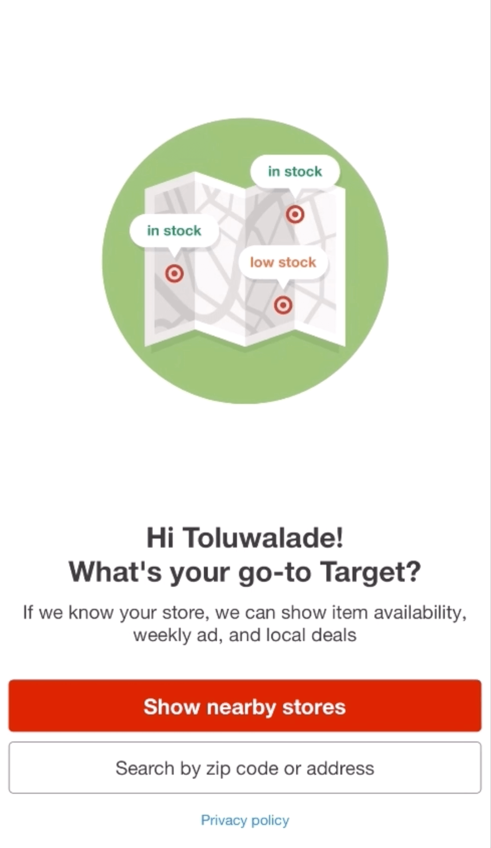
The first thing you see when you open the Target app is the onboarding screen. The animations paint the picture of what to expect from this app. Most people don't read onboarding screens anyways.
Highlight: Throughout the app, there's various onboarding explaining how the feature works. Whether it be the two-color or one-color choice, Target was consistent with its iconography selections. 🎨
Search Bar
Highlight: The search bar is typical except for the horizontal carousel for similar offers results. 🕵🏾♀️
Typography
Similar to Helvetica Neue


