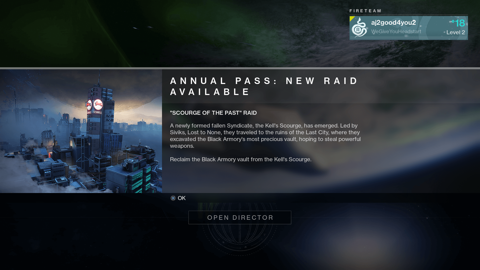
Destiny 2
A multiplayer first-person shooter with innovative free cursor control UI.
UI Credit: Bungie, Vicarious Visions, High Moon Studios
Missing your name? Let us know.
The Free Cursor
The selection is controlled with a cursor that moves throughout the UI.
The cursor has a dashed line that orbits when activated.
Highlight: It saves time and tedious effort that would be required if using traditional joystick methods. ⏰
Inventory/ Menu
The densely arranged gear icons are quick to recognize at a glance. Each icon looks handcrafted for its container.
The tooltips concisely display the data. The typography hierarchy makes the data accessible to read and understand.
Highlight: The inventory layout is nice and compact which allows for a high information density on a single screen. 👀
HUD
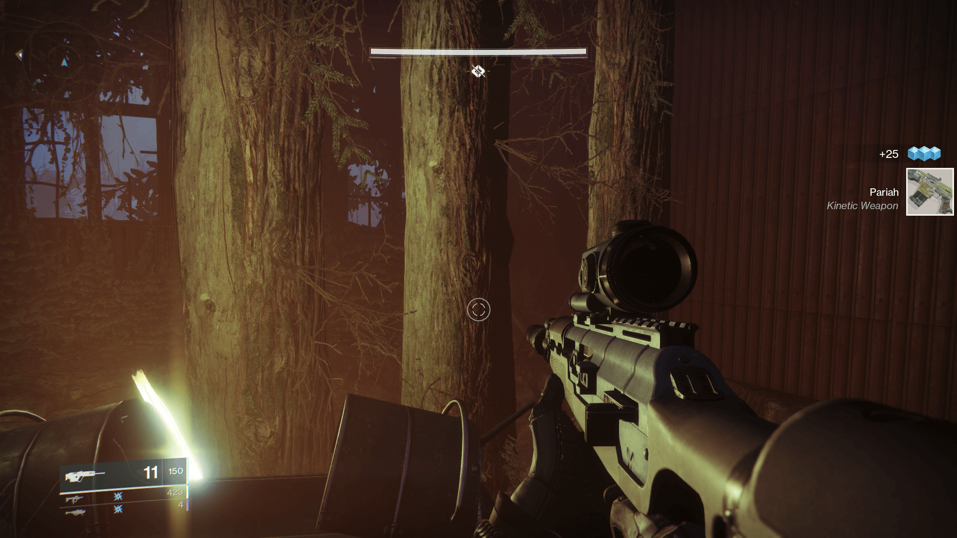
The damage numbers generated when attacking an enemy demonstrate great hierarchy. The yellow number has more prominence over the white numbers, but if you get a headshot, then the red number is more prominent.
Highlight: All the rectangular shaped elements in the Heads Up Display (HUD) have a slight curve which furthers the players' immersion into the game. 🎮
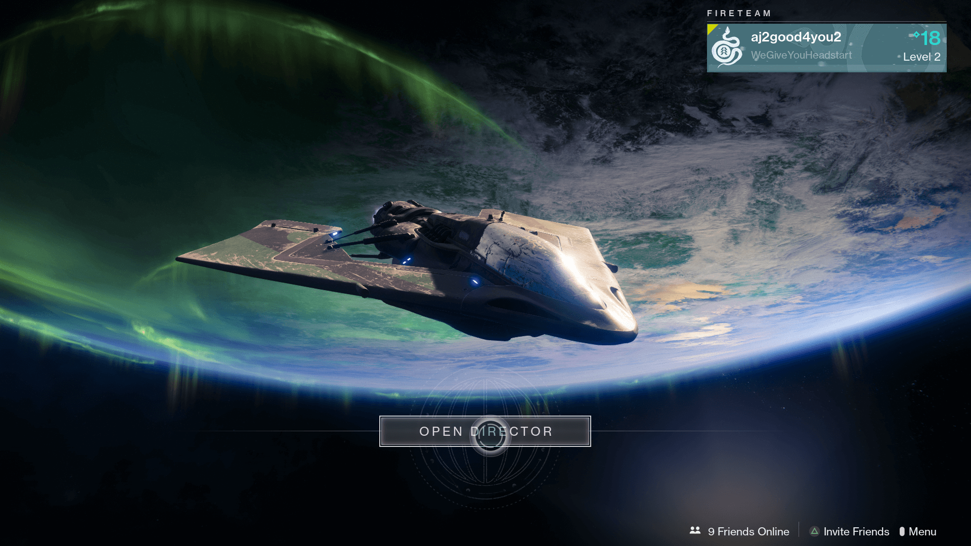
Destinations/ Director
It's exciting seeing the discovered planets populate on the destinations map. I feel a sense of accomplishment and aspiration as each vacant circle is filled.
The map offers a good sense of direction to inexperienced players.
Highlight: The map design is a lovely example of ancient cartography in a sci-fi and fantasy world. 🌍
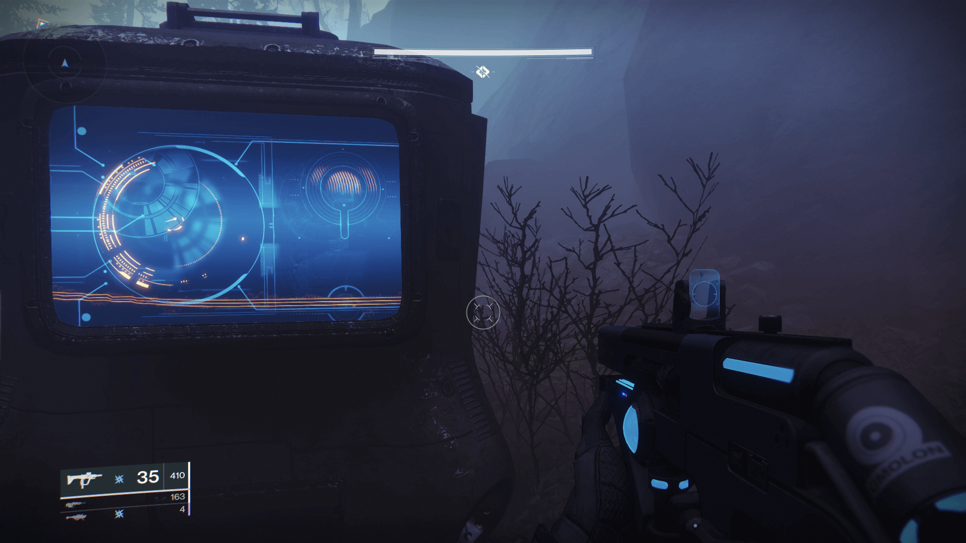
Data FUI
These screens are easy to miss while tackling the missions.
Highlight: Each Fictional User Interface (FUI) screen seems to have custom data applied from what I've seen so far. 📊 🤔
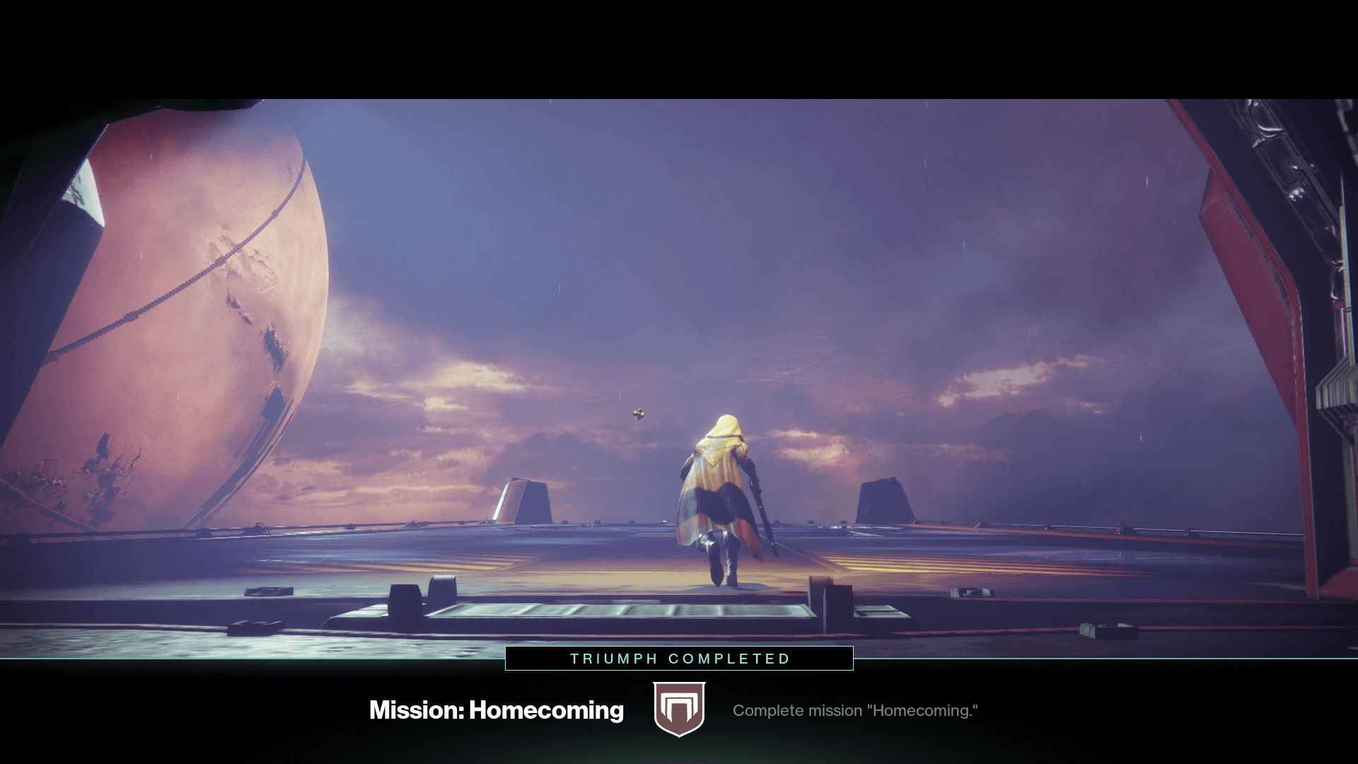
Achievements/ Level Up
The level up animation is nice and quick. It only interrupts the gameplay for 3 to 4 seconds.
Highlight: The new objective animation has a subtle wipe transition for the banner. It follows up with a dots and lines pop effect to reveal the title. 👀
Typography
Neue Haas Grotesk Text & Display Family


