Oddmar
An action-adventure platformer with physics-based puzzles and challenges.
UI Credit: Mobge
Missing your name? Let us know.
Integrated Tutorial
The onboarding tutorial is integrated into the gameplay.
Illustrated thumbs are used to demonstrate the motion gestures.
The 'SHIELD SLAM' motion gesture is demonstrated by broad yellow arrows that guide the player.
Highlight: Having the onboarding tutorial integrated into the gameplay sped up my learning curve.
Menu
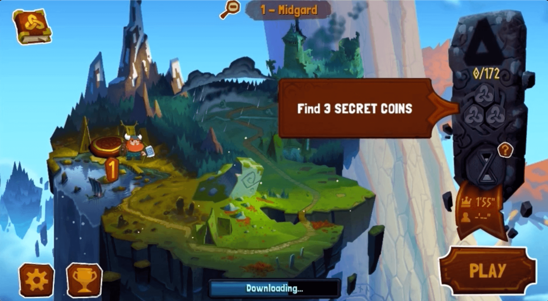
They use wooden and stone type textures for all the interface design which matches perfectly with the Viking theme. 🛡️
All the buttons I interacted with are very responsive. I had no issues with lag throughout my gameplay.
Highlight: The in-game menu gives the option to toggle on-screen controls. 👍🏾
Points/ Power-ups
The coin and point animations are shiny and pleasing to the eye.
When a level is complete, a meter is filled with gold liquid as it counts the number of points earned. The coins are animated with an elastic easeOut and Back function. They also fill the vacant coin spots as the points are tallied.
Highlight: There's a beautiful orbital animation inside the shield when it’s collected. It only lasts a second before it fades away, but it's long enough to see the rotation.
Inventory
The weapon icons are illustrated with a skeuomorphic style which fits the Viking theme. 🛡️
The points balance does a wiggle animation when you try to buy an item with insufficient funds.
Highlight: When you click an item to buy and have insufficient funds the merchant says, ”Nuh-uh” "Need more coins!". 😂
Checkpoint
The checkpoint object looks like a Golden Snitch without the wings — referring to the Harry Potter Quidditch matches.
Highlight: I love the elaborate interwoven pattern animated when the checkpoint is activated. ❤️
Typography
Similar to Londrina Family
Similar to Lagos Light


